ATTENTION!
FEATURES
TRAINING
Well-constructed visual aids are a first step to gaining a student’s attention and increasing his learning potential.
The fire service instructor has been given two very important tasks: one, to educate the entry level recruit so he can accomplish basic job requirements and operate safely; two, and possibly more critical, to continue educating and training all employees in the basic job requirements and new procedures.
These two tasks can be measured in terms of fewer damage reports, faster suppression of fires, and fewer job-related injuries. With downtime becoming more costly each year, the role of the instructor increases in importance. Quality of instruction, not quantity, should be paramount. The same lesson or drill gone over and over does not mean that training or learning has taken place.
The instructor is the critical link in the learning process. Keeping the interest and attention of the student is vital to quality learning. A lively, attentive give and take relationship between the instructor and the student is a difficult task at best, and at times it’s impossible. However, it’s the most important element in training if learning is to take place.
In the absence of initial attention, very little learning can result. As instructors, it is incumbent upon us to gain the attention and interest of the trainees. How we can accomplish this is sometimes a mystery to ourselves and our colleagues, but, unknowingly or knowingly, we employ learning postulates Some of these theories are:
- All learning is audiovisual. Instructors can be seen and heard. With few exceptions, all learning includes audible, visual or both experiences.
- When learning is not retained, time, effort, and money are wasted. When learning is only retained for a short period of time to either pass a test or satisfy the requirements of the course or instructor, no real learning has taken place._
- Each learner is unique, has worth and dignity, and is different from every other learner. Even if we deal with groups, we must realize they are individuals, and anything worth learning can be taught in forms that will relate to all students in the group.
- People resist learning what they do not understand, or what they are forced to learn. To keep the learners’ interest, we must provide relevance and show them a need for this knowledge, make it important to them.
- Almost all new changes proposed are the result of extensive knowledge of science and technology. Learners will resist these proposed “new” changes until they are given value in terms that “they” feel are important to “them.”
- The instructor must be able to overlap his field experiences with the learners’ field experiences. We should not forget what helped us to understand a new concept or learn a new technique. You cannot teach something that cannot be understood.
LEO O’CAMPO is the acting group manager for the fire prevention division of Arabian Bechtel Company in Al Jubail, Saudi Arabia.
With these points in mind let’s now look at how we can enhance long-term learning with the use of audiovisual aids, in particular the overhead projector and instructor presentation. Long-term learning is more than just a presentation by an instructor in front of a class, it includes:
- Visual composition.
- Handout materials.
- Instructor presentation.
By using all three parts fully, we have the equivalent of an electronic chalkboard.
Visual composition
Many of us lack the basic knowledge to efficiently use visual aids. Composition is basic to all media presentations. As instructors, We sometimes do not understand how important composition is to our presentation. Have you ever wondered why an overhead missed the main point or got across the wrong message? It could have been the arrangement of the components, the visibility, the legibility, or the graphic characteristics.
Visibility is important to the overall design. If the students cannot see it, they cannot learn from it. The natural tendency of the student is to engage the visual at the upper left-hand corner, then move right and downward towards the right-hand corner. An effective visual will use this tendency and recycle the viewers’ eyes to the starting point. A repeat of the viewing area improves the message impact and reinforces learning. A rule of thumb to provide appropriate letter and image size is 1/4 inch for each three feet of viewing distance. That is, if your classroom is 30 feet deep, the letters or image projected should be at least 2 1/2 inches tall. There are many commercially available templates of visibility standards that take into account the size of the screen and the distance of the learner. Remember that any significant details must be large enough for clear perception and accurate interpretation. Each transparency should ideally have only one entire thought unless you’re trying to show a complete relationship.
Legibility is closely related to visibility, but has its own characteristics. There are several major characteristics to consider in legibility.
- Types of letters used. The simple block letters are best, and are generally considered the most readable. Avoid using serif type.
- When using two different sizes of letters, the smaller one must conform to minimum viewing standards.
- Spacing should be large enough to create resolution, but small enough to maintain cohesion. Spacing between words should be at least 1 ½ times the spacing between the letters.
- Some relationship between the size of the image and word thickness should be maintained, and the image should be concrete, able to be interpreted by the learner. Any significant detail must be seen by all students.
Graphic characteristics used in the visual composition will determine how good a visual is. Even the simple line can convey many meanings to the learner if used properly.
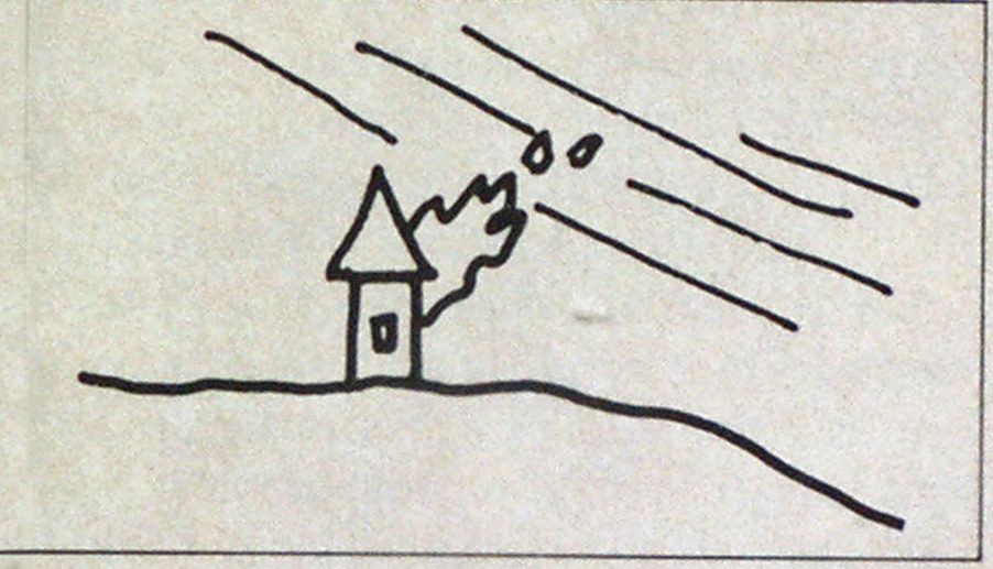
Diagonal lines denote movement, directing the eye to move across the scene.

Curved lines suggest flow or change. Long curved lines represent slow change of direction. Short curves suggest rapid changes of motion.


Horizontal lines lend themselves to the sensations of peace and quiet.

Used without details, the same horiontal lines can suggest barrenness, vastness, emptiness.

Using a series of horizontal lines in regularly ascending or descending lengths can portray spatial qualities of depth.

Vertical lines suggest strength or barriers, as well as portraying the qualities of height. Convex verticals tend to move the eye from the top of the graphic to the base; concave verticals direct the eye from the base to the top.


Curlicues or tight overlapping circles suggest turmoil or unrest. The more curlicues, the greater the feeling of turmoil. By adding color to the curlicues the visual can be enhanced and intensified.

When making visuals, six principles should be used:
- simplicity
- dominance
- patterns
- balance variation
- harmony
Simplicity is important in visuals so that we don’t overload our ability to see what’s important. A simple visual is uncluttered, uses few colors, and makes generous use of “white” space. Simplicity is achieved when the visual presents one single concept or idea. Only relevant cues are included, there are no inaccuracies, and all symbols used have meaning and relationship to each other.


Dominance is when the viewer’s attention is concentrated on the most significant element of the visual. Many techniques can be used to establish dominance: color, high contrast, shape, and size. But remember to keep simplicity in mind and don’t get carried away.

One simple technique to establish dominance is the use of the rule of thirds. This rule postulates that any visual field can be divided into thirds horizontally, vertically, or both, forcing the eye to important areas.


Placing an item in different visual thirds provides meaning and cues to the viewer. The center of the field provides and projects immobility.

Moving the same item to one of the divisional lines suggests motion or fluidity.

Dynamic, fluid, or uncertain points in the fields are at the intersections of the divisional lines.


The point of most impact for western cultures is the upper left corner. Our eyes tend to start here and move across the visual, as if we were reading a book.
In any case, when using the rule of thirds stay away from the edges of the field, unless you have a very important reason to use this unusual practice.

The edges tend to confuse the viewer, suggesting irrationality and confusion.

The student may lose the logic of the visual and added time will have to be spent getting his mind back to the presentation.
Patterns can greatly enhance the impact of a visual. Familiar patterns will attract the student’s eye to important points. Patterns can be used to move the eye through the visual and back to the starting point. The best patterns to use are geometric (squares, triangles, stars, etc.) and alphabetical (a, b, c, etc.). Numerical patterns should be avoided because they tend to confuse the eye (3, 4, 5).


These types of patterns cue the students eyes, telling them where to move next.


When planning a pattern layout, remember that words and pictures make up a part of the pattern.
Balance is an important factor in visuals, as this is how we perceive mass in the visual field (mass being the idea or the concept of weight). Both positive and negative balance can be created depending on the placement of the mass. Positive balance, with the mass towards the center of the visual, creates the feeling of stability, certainty, and security, adding reliability and credibility to the presentation. Negative balance (or imbalance) produces the conception of instability and insecurity, promoting the idea of unreliablity and lack of integrity in the presentation.
Generally, viewers expect large dark objects (which denote heavy masses) at the lower portion of the visual, small light colored objects (which denote light masses) in the upper part of the visual. Even though these changes are very subtle, they do provide cues for the viewer’s mind. It’s best, therefore, to follow the rules of balance, making the visual and presentation reliable.
Variation and harmony are closely related as they tend to support each other. Variation is made up of shape, size, texture, color, line position, dimension, contrast, and organization.

By varying these elements, the instructor can increase the impact of the visual.
The relationship between the elemerits, of variation is harmony. Harmony ties the visual picture together, giving it flow or predictability. The feelings created by harmony are confidence, certainty, and relationships.
Continued on page 76
Continued from page 74


Handout materials
Many times, the simple handout can help the student more than the best visual aids money can buy. Handouts focus the learner’s attention to relevant information and facts. They provide resource material for further study and serve as a link between the instructor and the visual. Well designed and well-thought-out handouts will add continuity between learning experiences and provide a starting point for the next lesson.
A good rule to follow is that if the point is important enough to have a visual made, then it is equally important to provide the student with a handout. This allows two things to take place: First, the student is provided with an opportunity to follow the presentation and to add notes to his handout as the instructor points out the facts. Second, the student is not forced into making an on-the-spot reproduc, tion of the visual, which can draw his attention away from the information being presented.
Handouts should be used strategically, handed out when appropriate and in order of use. The passing out of material should take place at the beginning of class, not during the presentation. Only handout material needed for that particular presentation should be passed out. Many students will spend class time looking through all the new material then asking the instructor to repeat missed information.
Provide instructions in how the handouts should be used. If the material is a multiple use item, be sure to show relationships between the handouts and the visuals and tell the student to keep it aside to be used later. Prepare a reference source for your material. Whether this is to be given to the student can be left up to the instructor; however, if the student desires more information, he can be given further sources of study quickly and easily.
Effective handouts are attractive, that is, they possess qualities that make the students want to keep them and store them for later reference (pre-punched for notebooks, pre-stapled, coversheets, etc.).
Handouts, like all learning tools, have an entry level. The students should be at the appropriate entry level before the handout will become an effective learning tool. If the handout has new terms, concepts or ideas, explain these before showing the overall relationship of the handout to what is being taught.
Instructor presentation
Presentations are grouped into two categories, live and recorded. The most common presentation used is the live presentation or lecture. However, each type has its own advantages, and it is important to choose the presentation that will assure the achievement of your learning objective.
With the use of the overhead projector, the live presentation is probably the best choice. It has the ability to let the student interact with the instructor. In this respect the human voice is a powerful medium. It can hold attention, motivate, convey information, and stimulate response. It is by far the best choice for detailed or complex learning. The lecture can:
- Precisely determine the content and organization of the class.
- Cover large blocks of information in a short time.
- Bring out important points to the students so they’re not overlooked.
- Give the instructor maximum control of the class proceedings, letting him determine starting times, information covered, and stopping point.
Instructors who use the lecture method should develop expertise in their subject. If you’re using a textbook or handout, read it thoroughly and understand its use before class starts. Prepare your class lecture with notes and an outline. You might even develop a file of material to back up the lecture. At the close of the class, review the important items covered.
No one teaching method or media will be all things to all learners. The exceptional students will learn no matter what media is used, and almost certainly will progress in the ranks of the fire service. But, as instructors, we owe all students an equal opportunity to compete in the ranks. Our students are unique and deserve our best efforts. How well or poorly we teach them will be reflected in their performance for years to come.